Code
library(tidyverse)
library(primer.data)The function ggplot() is essential to any data scientist. It is a really simple way to graph data, make maps, and make neat things. It might seem really hard at first, you have to learn a formula, keep all the geoms straight (or curvy, if you need to), and it will be overwhelming. Don’t be scared though, because once you learn the basics, all will become clear! Let’s begin!
Here, I’m loading my libraries. The package tidyverse includes eight packages, one of them being ggplot. The package primer.data has more datasets than the ones built in to R.
library(tidyverse)
library(primer.data)Once you’ve loaded your libraries, it’s time to start plotting! Start your plot by typing ggplot(). Right now, if you run it, it will not show anything, because we don’t have data!
ggplot()
We are going to be using the dataset called nhanes. Inside ggplot(), set data equal to nhanes. If you want to see the dataset, put > glimpse(nhanes) in your console.
ggplot(data = nhanes)
Do not worry about the graph being blank at this point, because we have not added axes or geoms, so there is nothing on the graph.
Inside ggplot() after the nhanes, you should type mapping = aes(). Inside aes(), we are going to put the x, the y, and the color.
ggplot(data = nhanes,
       mapping = aes())
Let’s start graphing! In aes(), choose your x, your y, and your color. I am going to be using height for x, weight for y, and gender for color.
ggplot(data = nhanes,
       mapping = aes(x = height,
                     y = weight,
                     color = gender))
Now it has an empty graph, instead of just blank because we added the axes. But there is still nothing on the graph!
We need to add a geom to the graph! A geom is what shows us the data. We add a layer by using ‘+’ Let’s use geom_point to make a Scatterplot.
ggplot(data = nhanes,
       mapping = aes(x = height,
                     y = weight,
                     color = gender))+
  geom_point()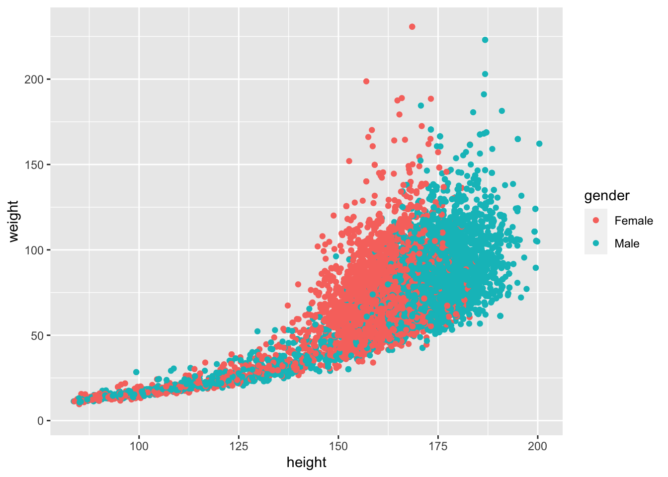
Hmmmm. Our graph doesn’t look quite right. There’s a lot of overplotting! We can fix that by changing alpha to 0.3 within the geom.That will change the opacity of the dots. Let’s also go ahead and change the size of the dots by adding another argument to geom_point. Let’s change the size to 0.5.
ggplot(data = nhanes,
       mapping = aes(x = height,
                     y = weight,
                     color = gender)) +
  geom_point(alpha = 0.3, size =  0.5)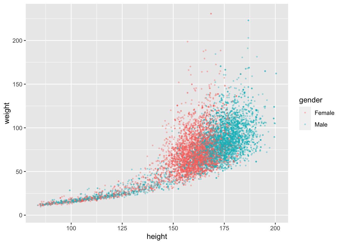
That looks much nicer. But what if we want to separate the gender so they don’t touch?
We are going to add another layer called facet_wrap. This will separate the graph and make a Female graph and a Male graph.
ggplot(data = nhanes,
       mapping = aes(x = height,
                     y = weight,
                     color = gender)) +
  geom_point(alpha = 0.3, size =  0.5) +
  facet_wrap(~gender)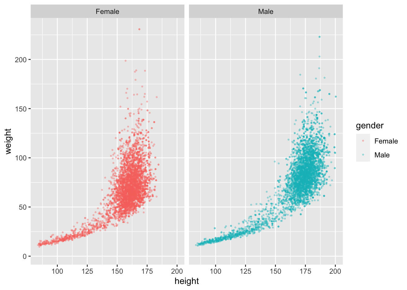
Now we have two separate graphs!
Now we’re going to add a trend line. Let’s add geom_smooth to the graph. We are going to want it by geom_point, that way all the geoms are next to each other. Now we need a ‘+’ to add the facet_wrap layer. Once we add the geom_smooth, it is going to be super crowded, and the line will be almost invisible. We can change that by setting alpha (in geom_point) to 0.1. This will reduce crowding significantly.
ggplot(data = nhanes,
       mapping = aes(x = height,
                     y = weight,
                     color = gender)) +
  geom_point(alpha = 0.1, size =  0.5) +
  geom_smooth() +
  facet_wrap(~gender)
Now, I want a smoother curve. In geom_smooth, we are going to set the method to "loess", and the formula to y~x. The method "loess" makes a smoother curve, and formula y~x means that y has something to do with x.
ggplot(data = nhanes,
       mapping = aes(x = height,
                     y = weight,
                     color = gender)) +
  geom_point(alpha = 0.1, size =  0.5) +
  geom_smooth(method = "loess", formula = y~x) +
  facet_wrap(~gender)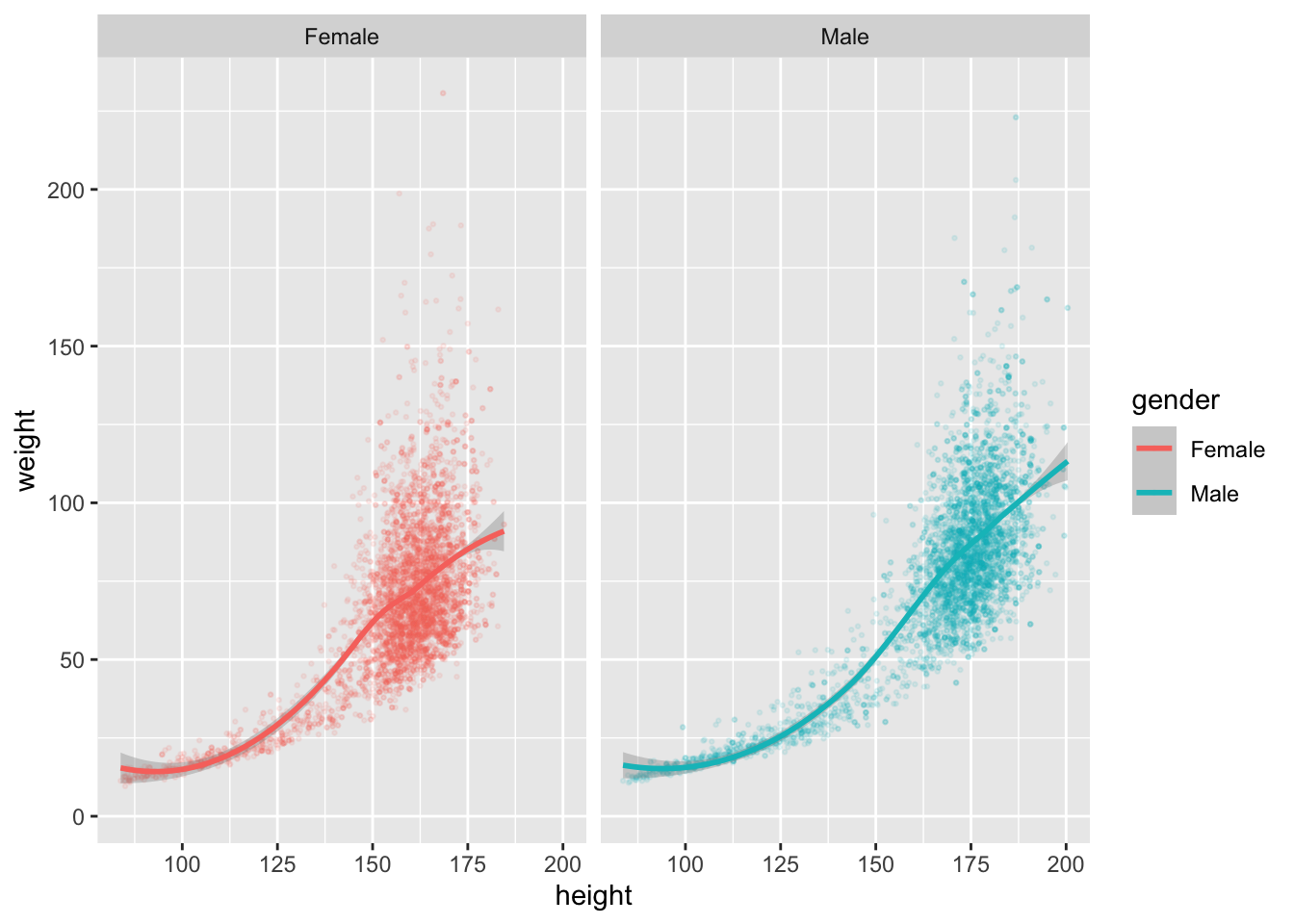
Now it’s looking pretty neat!
Here, we are going to start adding labels. Add another layer with ‘+’, and then type labs(). Inside labs(), we can add a label for title, subtitle, caption, x, y, and the legend. Choose a title and subtitle that relate to the graph. Make sure you put the text in quotation marks (““), otherwise you will get a bunch of errors.
ggplot(data = nhanes,
       mapping = aes(x = height,
                     y = weight,
                     color = gender)) +
  geom_point(alpha = 0.1, size =  0.5) +
  geom_smooth(method = "loess", formula = y~x) +
  facet_wrap(~gender) +
  labs(title = "Heights in the U.S.",
       subtitle = "On average, men weigh more and are taller than women")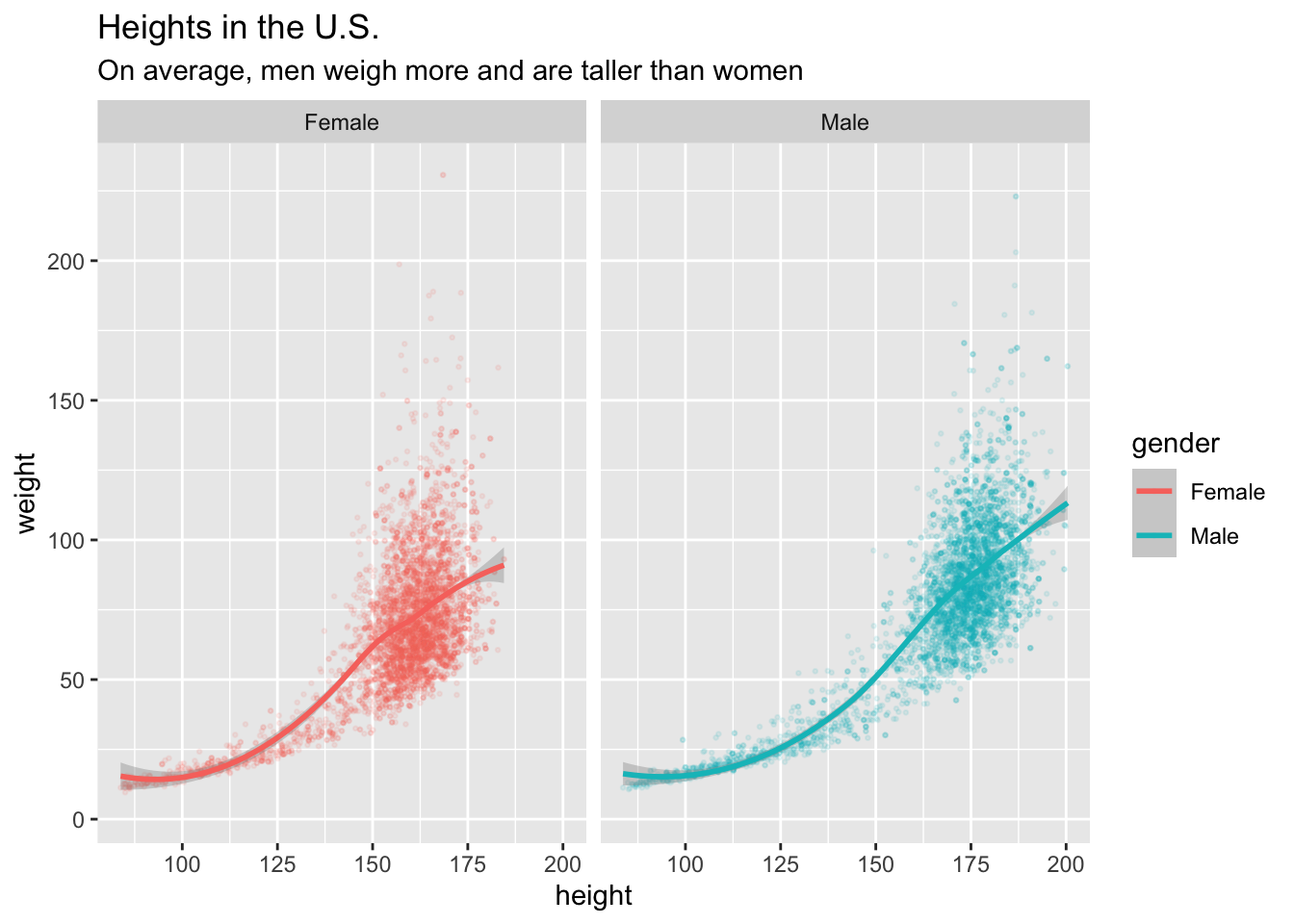
Now we have a title and subtitle, but the x and y axes labels don’t look very nice. Let’s fix that. Set x equal to “Height (cm)” and y equal to “Weight (kg)”.
ggplot(data = nhanes,
       mapping = aes(x = height,
                     y = weight,
                     color = gender)) +
  geom_point(alpha = 0.1, size =  0.5) +
  geom_smooth(method = "loess", formula = y~x) +
  facet_wrap(~gender) +
  labs(title = "Heights in the U.S.",
       subtitle = "On average, men weigh more and are taller than women",
       x = "Height (cm)",
       y = "Weight (kg)")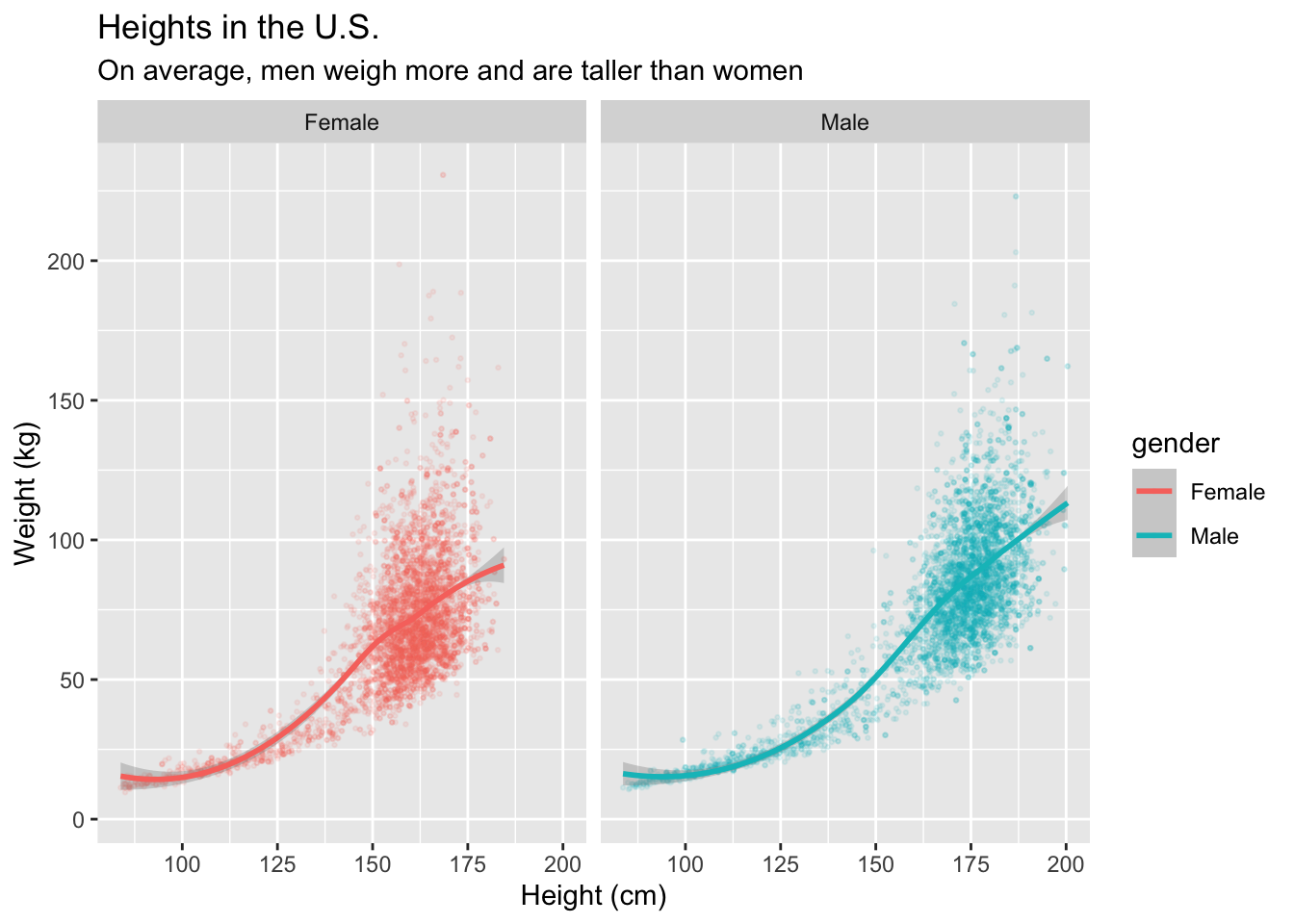
Awesome! But what about the “gender” above the legend?
In the aes() we set x equal to height, y equal to weight, and color equal to gender. We changed x and y, and we can change “gender” the same way! We can set color equal to “Gender”, and that will fix the lowercase “gender” on the legend.
ggplot(data = nhanes,
       mapping = aes(x = height,
                     y = weight,
                     color = gender)) +
  geom_point(alpha = 0.1, size =  0.5) +
  geom_smooth(method = "loess", formula = y~x) +
  facet_wrap(~gender) +
  labs(title = "Heights in the U.S.",
       subtitle = "On average, men weigh more and are taller than women",
       x = "Height (cm)",
       y = "Weight (kg)",
       color = "Gender")
What if we want to give credit to the source of the data?
This data came from NHANES, the National Health and Nutrition Examination Survey, so we want to credit that source. How do we do that? We add a caption!
ggplot(data = nhanes,
       mapping = aes(x = height,
                     y = weight,
                     color = gender)) +
  geom_point(alpha = 0.1, size =  0.5) +
  geom_smooth(method = "loess", formula = y~x) +
  facet_wrap(~gender) +
  labs(title = "Heights in the U.S.",
       subtitle = "On average, men weigh more and are taller than women",
       x = "Height (cm)",
       y = "Weight (kg)",
       color = "Gender",
       caption = "Source: National Health and Nutrition Examination Survey")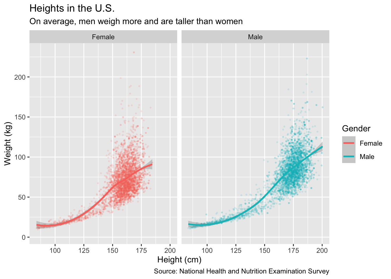
That is a pretty cool looking graph! But, I don’t like the pink and blue that ggplot() chose. How do I change that?
There are two ways to solve this problem. One way is to hand pick the built in colors from R, like "blue" and "magenta". We want to do the function scale_color_manual() right after the geoms, just to be more organized. Inside, we will put values = c. That makes a list of the colors that we want.That will look something like this:
ggplot(data = nhanes,
       mapping = aes(x = height,
                     y = weight,
                     color = gender)) +
  geom_point(alpha = 0.1, size =  0.5) +
  geom_smooth(method = "loess", formula = y~x) +
  scale_color_manual(values = c("magenta",
                                "blue"))+
  facet_wrap(~gender) +
  labs(title = "Heights in the U.S.",
       subtitle = "On average, men weigh more and are taller than women",
       x = "Height (cm)",
       y = "Weight (kg)",
       color = "Gender",
       caption = "Source: National Health and Nutrition Examination Survey")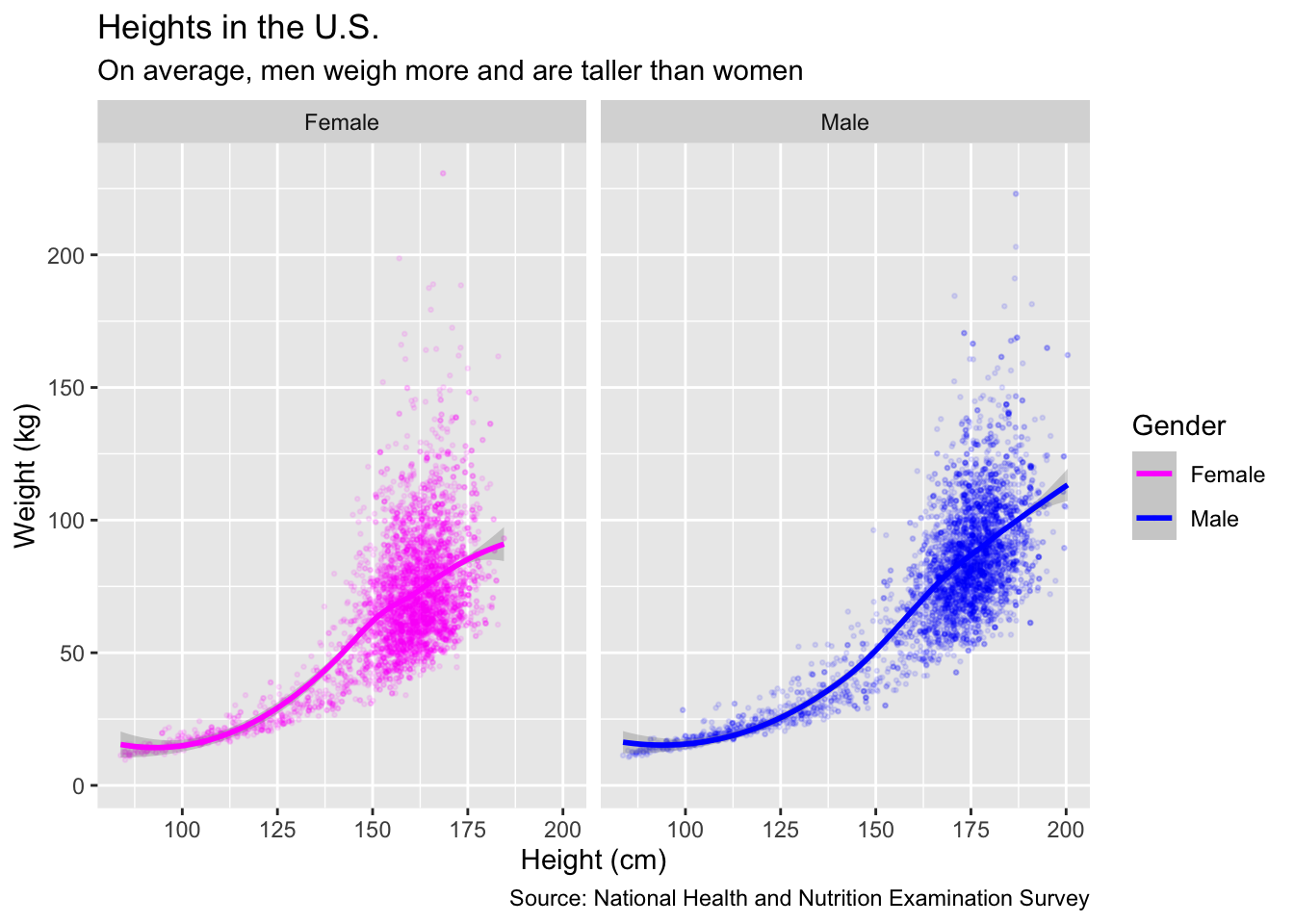
But what if we don’t want the built in R colors? You can also use HEX codes for your colors. I searched “color picker” in my browser and picked a pink and a blue HEX. It is almost the same, you just put the HEX instead of "color" in the scale_color_manual. It will look something like this:
ggplot(data = nhanes,
       mapping = aes(x = height,
                     y = weight,
                     color = gender)) +
  geom_point(alpha = 0.1, size =  0.5) +
  geom_smooth(method = "loess", formula = y~x) +
  scale_color_manual(values = c("#ba4c85",
                                "#5f4cba"))+
  facet_wrap(~gender) +
  labs(title = "Heights in the U.S.",
       subtitle = "On average, men weigh more and are taller than women",
       x = "Height (cm)",
       y = "Weight (kg)",
       color = "Gender",
       caption = "Source: National Health and Nutrition Examination Survey")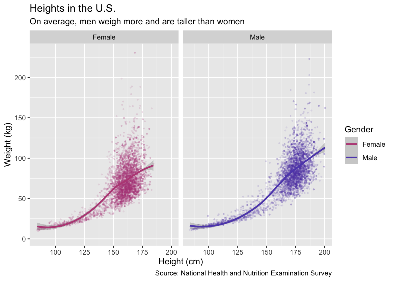
That looks super nice with the custom colors. Let’s take a look at the HEX colors again. they are #ba4c85 and #5f4cba. Which one is pink and which one is blue? You can’t tell without looking at both the code and the graph.
Comments in the Code
This is where comments come in. They are really easy to add to your code, all it is is a
#(pound sign, not hashtag!). Anything after a#will not run in the code. We can add comments like# Pinkor# Blue. After making comments, it will look like this:Code
Now you can easily read the code, and the graph looks nice!
As you can see,
ggplot()is actually really simple to use.