Code
library(tidyverse)
library(gapminder)
library(MetBrewer)
library(plotly)The function ggplotly is a way to make graphs interactive. It is in the function ggplot(). We are going to be making a scatterplot. Let’s go!
I’m loading in my libraries here. I will be using the package tidyverse, which includes ggplot, the package gapminder, that’s the data we’re using, and MetBrewer, one of the solutions for changing the colors.
library(tidyverse)
library(gapminder)
library(MetBrewer)
library(plotly)Great! We know what data we’re using, so we can start plotting!
We can start making the plot now. We start it off with ggplot, set data equal to gapminder, and we add lifeExp to the y axis and gdpPercap to the x axis inside of mapping = aes().
ggplot(data = gapminder,
       mapping = aes(x = gdpPercap,
                     y = lifeExp))
Now, we can add the geom.
We are going to be using geom_point() to make a scatterplot. Add another layer to your graph with ‘+’.
ggplot(data = gapminder,
       mapping = aes(x = gdpPercap,
                     y = lifeExp))+
  geom_point(alpha = 0.3)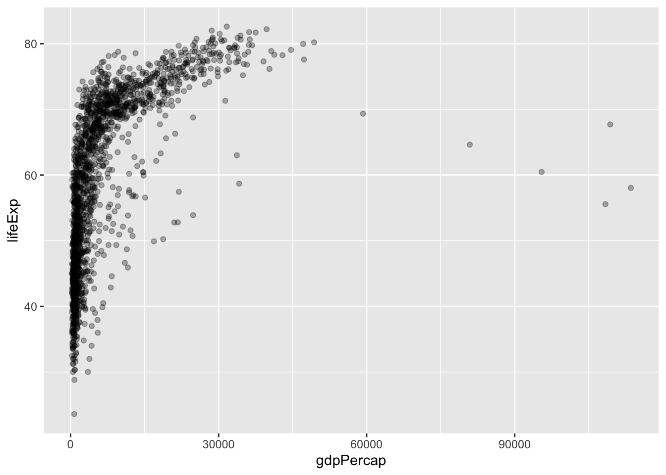
That’s just a bunch of black dots. How about we change the colors.
There are many ways to change the colors, I cover 3 ways in my tutorial “How to make a Histogram”. I will just be covering MetBrewer.
Let’s set color equal to continent within aes().
ggplot(data = gapminder,
       mapping = aes(x = gdpPercap,
                     y = lifeExp,
                     color = continent)) +
  geom_point(alpha = 0.3)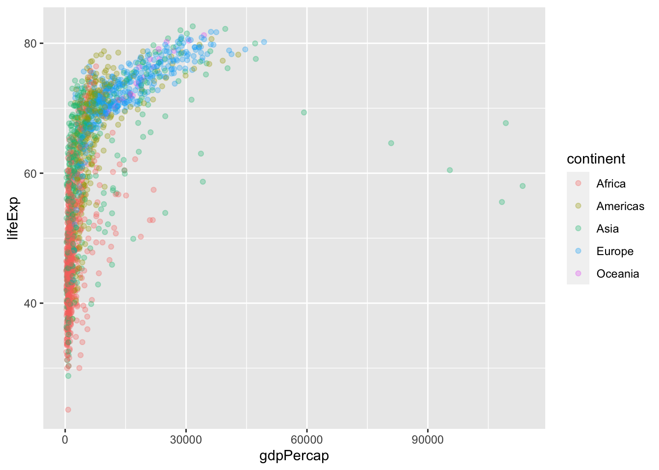
Now, we can see clearly what continents are healthier and wealthier. What if we changed the colors to a nicer palette?
MetBrewer is a package that has beautiful color palettes that are made from art in the MET. We will use one that has 5 distinct colors to use for our plot. I chose “Lakota” and selected 5 colors from it, using a new layer, with scale_color_manual(values = met.brewer()). This allows you to make your own list of colors you want for your graph. I also changed the size population, just to make things more interesting. I also got rid of the alpha, but we will fix that soon
ggplot(data = gapminder,
       mapping = aes(x = gdpPercap,
                     y = lifeExp,
                     size = pop,
                     color = continent)) +
  geom_point(alpha = 0.3) +
  scale_color_manual(values = met.brewer("Lakota", 5))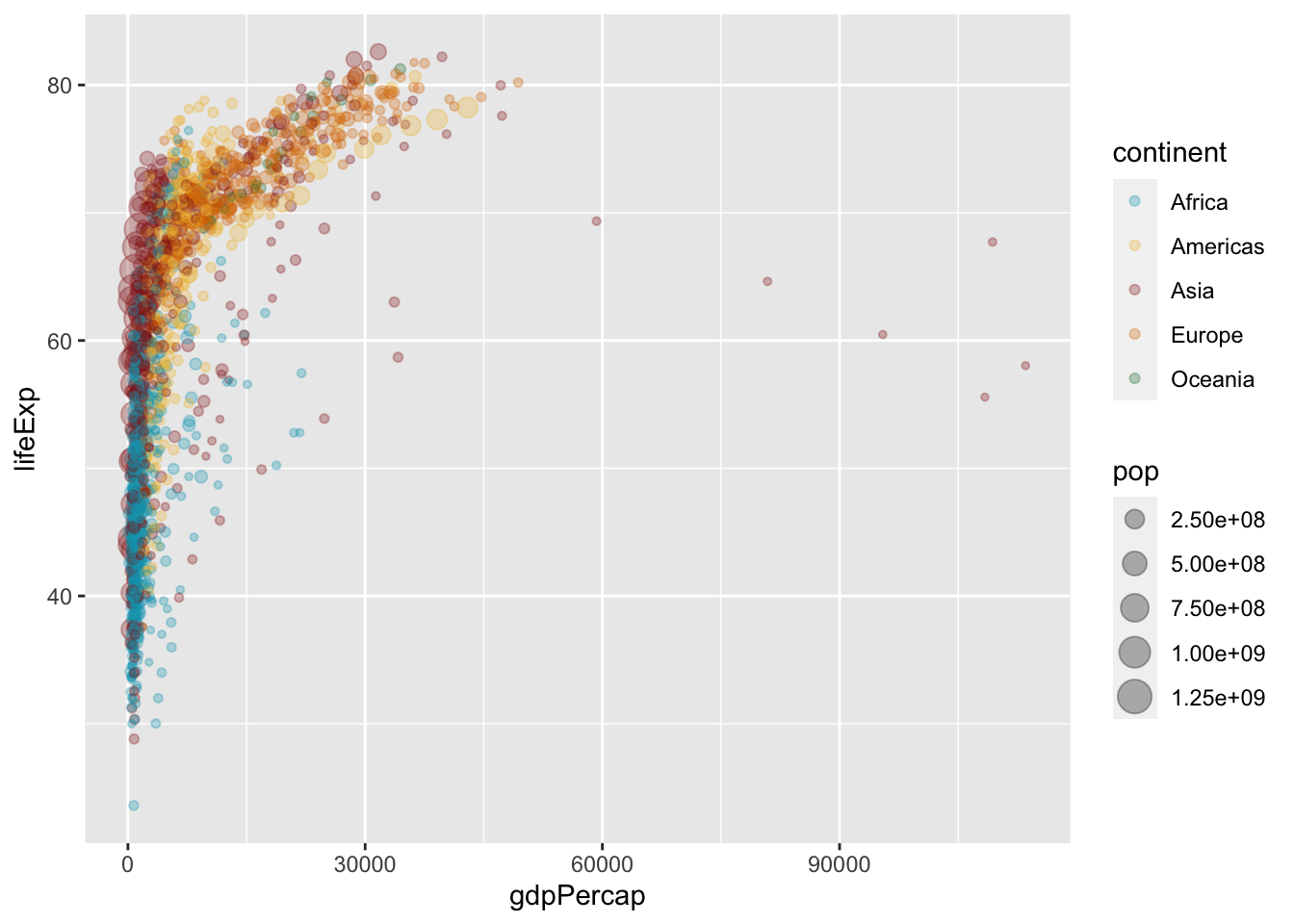
Let’s load in the package scales.
library(scales)The graph that we have right now actually has duplicate countries! We can fix that by filtering the year to 2007. We’re going to name the different gapminder gapminder_2007, like this:
gapminder_2007 <- gapminder |>
  filter(year == 2007)
Now, we need to change the graph so that it is gapminder_2007 for the data instead of gapminder. Now that there are less points, we can have the alpha at full opacity.
ggplot(data = gapminder_2007,
       mapping = aes(x = gdpPercap,
                     y = lifeExp,
                     size = pop,
                     color = continent)) +
  geom_point() +
  scale_color_manual(values = met.brewer("Lakota", 5))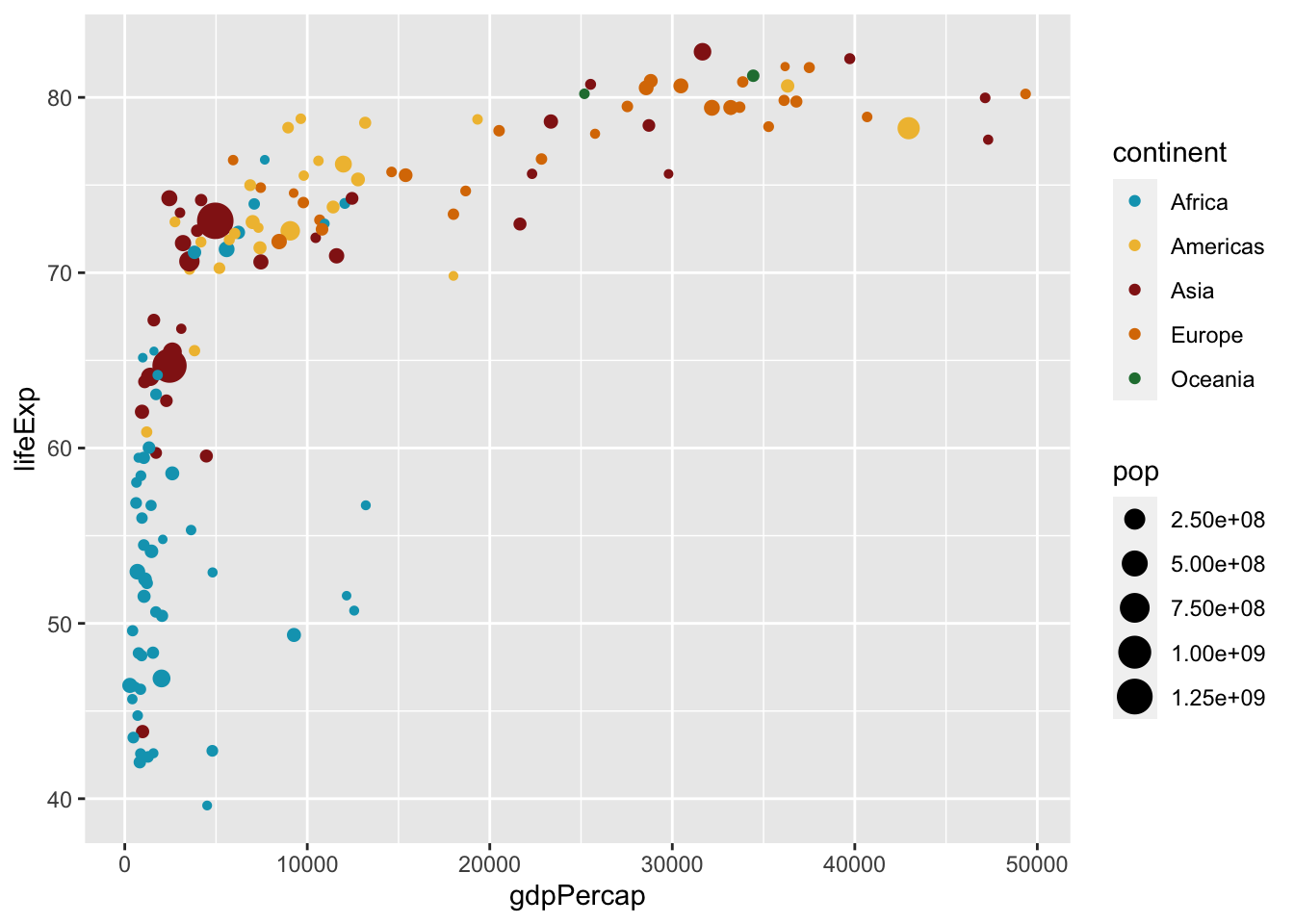
That looks a lot neater and cleaner than it did before! Let’s add some more scales!
Here, I’m making the x-axis logarithmic to change the axis to be more specific than $10,000 gaps.
ggplot(data = gapminder_2007,
       mapping = aes(x = gdpPercap,
                     y = lifeExp,
                     size = pop,
                     color = continent)) +
  geom_point() +
  scale_color_manual(values = met.brewer("Lakota", 5)) +
  scale_x_log10(labels = label_dollar(accuracy = 1),
                breaks = c(400, 4000, 40000))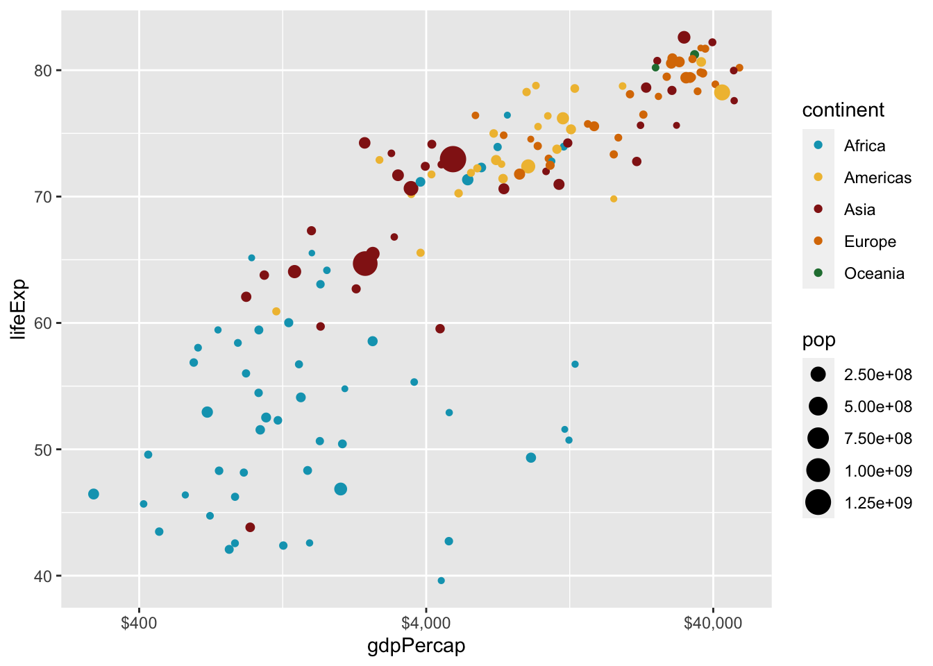
Now let’s change the population legend from that ugly NUMBERe+NUMBER, and change it to nicer looking numbers that we can actually read! We do that by adding scale_size_continuous(labels = comma) to the code. That will make the size legend have numbers with commas in them.
ggplot(data = gapminder_2007,
       mapping = aes(x = gdpPercap,
                     y = lifeExp,
                     size = pop,
                     color = continent)) +
  geom_point() +
  scale_color_manual(values = met.brewer("Lakota", 5)) +
  scale_x_log10(labels = label_dollar(accuracy = 1),
                breaks = c(400, 4000, 40000)) +
  scale_size_continuous(labels = comma)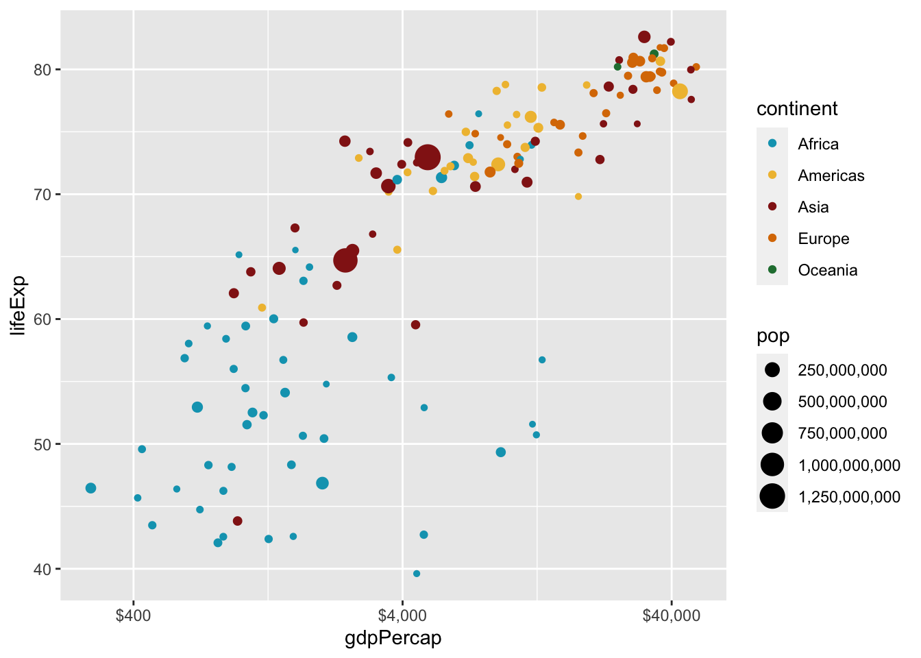
alphaThere is still overplotting in this graph! I don’t want to change the alpha, because I like the opacity. That is easily fixable with adding just a few things to our code!
There are actually 25 different shapes you can use in a scatterplot. We are going to be using shape 21, a circle, with a border. You can access the shapes by typing pch into your help page, or ?pch in your console. The border is important because it can stop confusion about overplotting. The only big change in the code is changing color to fill.
ggplot(data = gapminder_2007,
       mapping = aes(x = gdpPercap,
                     y = lifeExp,
                     size = pop,
                     fill = continent)) +
  geom_point(shape = 21, color = "white") +
  scale_fill_manual(values = met.brewer("Lakota", 5)) +
  scale_x_log10(labels = label_dollar(accuracy = 1),
                breaks = c(400, 4000, 40000)) +
  scale_size_continuous(labels = comma)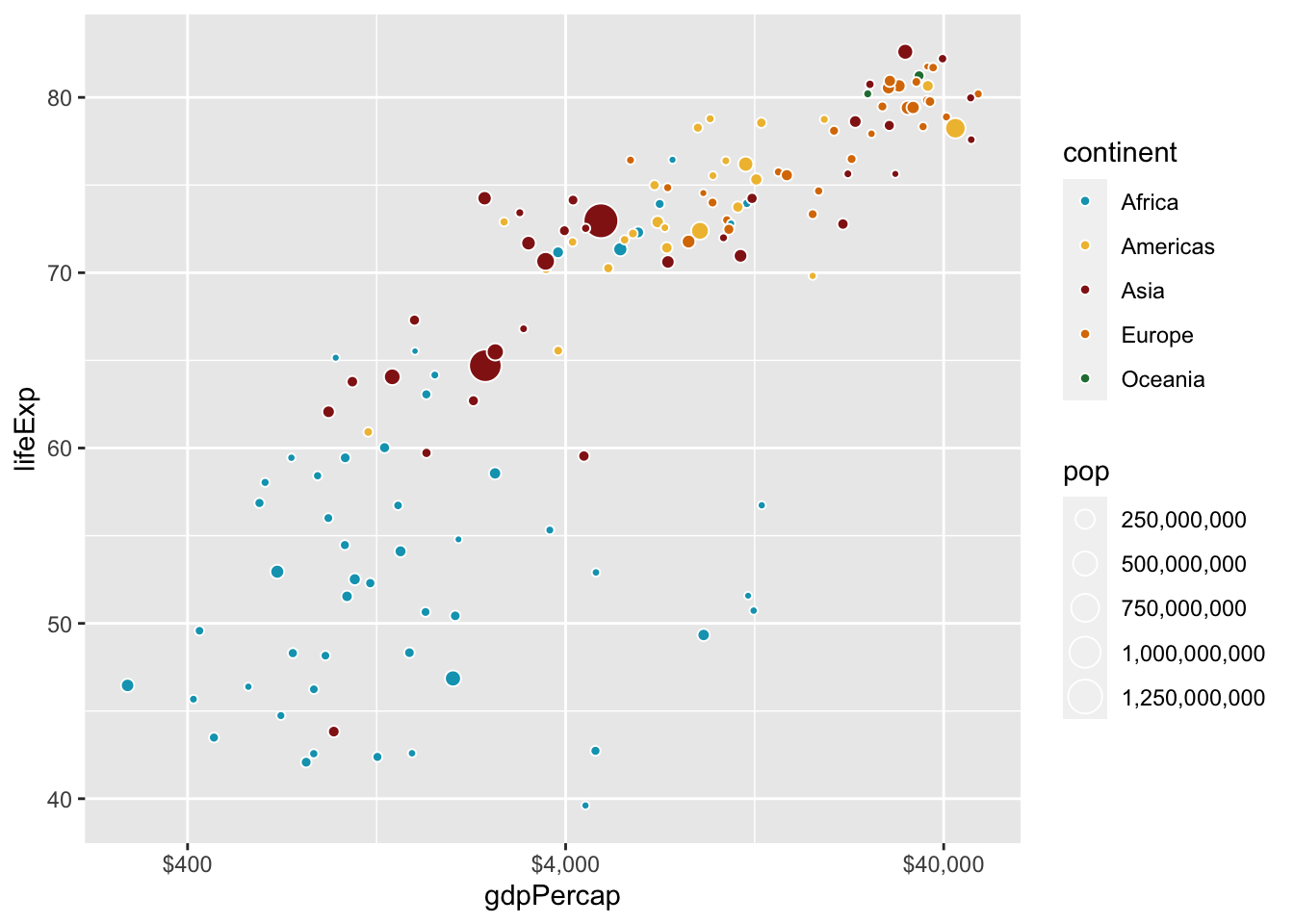
I am going to change my theme to theme_bw, but I will not cover themes completely in depth. Themes can help change the feel of a graph.
ggplot(data = gapminder_2007,
       mapping = aes(x = gdpPercap,
                     y = lifeExp,
                     size = pop,
                     fill = continent)) +
  geom_point(shape = 21, color = "white") +
  scale_fill_manual(values = met.brewer("Lakota", 5)) +
  scale_x_log10(labels = label_dollar(accuracy = 1),
                breaks = c(400, 4000, 40000)) +
  scale_size_continuous(labels = comma)+
  theme_bw()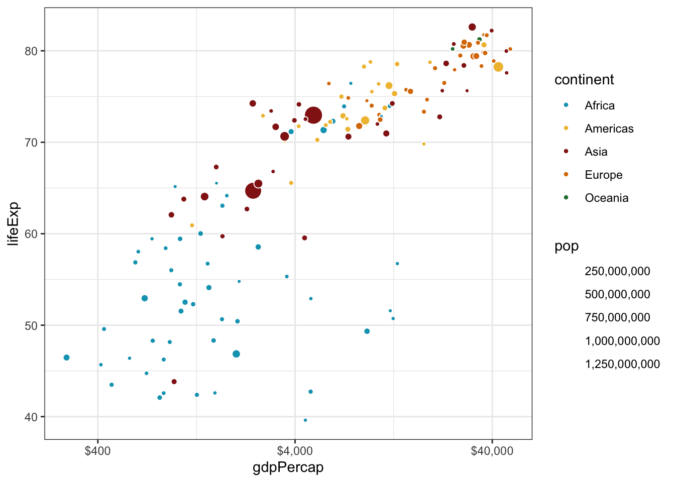
I am not going to cover the function labs() fully, but it is another layer you can add to your plot to add a title, subtitle, caption, legend title, and labels for the x and y axes.
ggplot(data = gapminder_2007,
       mapping = aes(x = gdpPercap,
                     y = lifeExp,
                     size = pop,
                     fill = continent)) +
  geom_point(shape = 21, color = "white") +
  scale_fill_manual(values = met.brewer("Lakota", 5)) +
  scale_x_log10(labels = label_dollar(accuracy = 1),
                breaks = c(400, 4000, 40000)) +
  scale_size_continuous(labels = comma) +
  theme_bw() +
  labs(title = "Gdp and Life Expectancy in 142 countries",
       subtitle = "Most of Africa is sick and poor,\nwhile Europe is thriving and rich",
       x = "Gdp Per Capita",
       y = "Life Expectancy",
       fill = "Continent",
       size = "Population")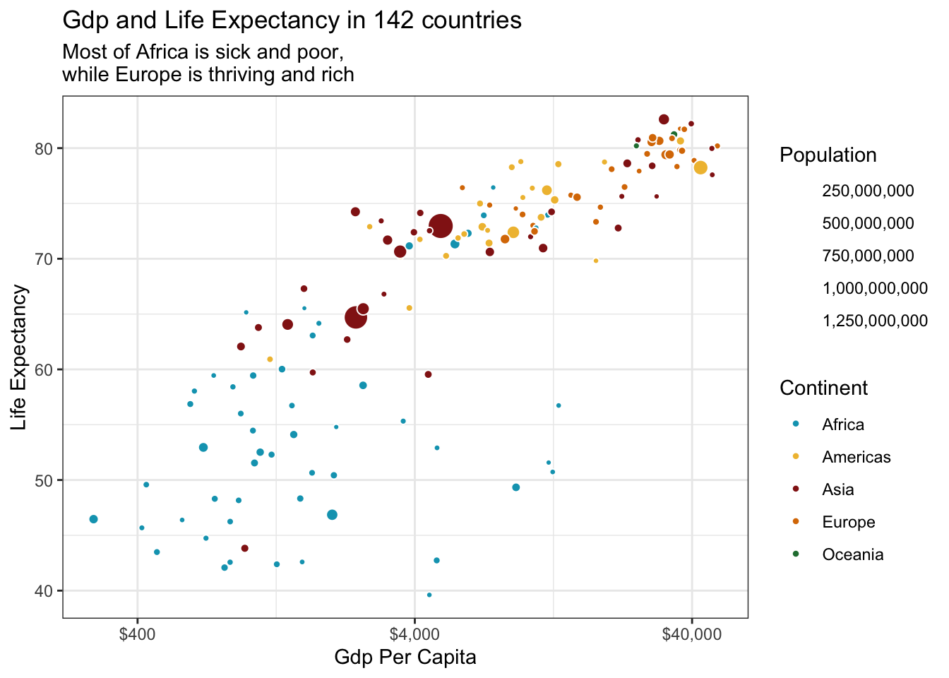
Wait a minute! Now we can’t see the population guide! We can change that by adding just a couple things to our code. First, we are going to make the legend for the continents just a little bit bigger, so it’s easier to see. We will also make the scale_size_continuous color be black.
ggplot(data = gapminder_2007,
       mapping = aes(x = gdpPercap,
                     y = lifeExp,
                     size = pop,
                     fill = continent)) +
  geom_point(shape = 21, color = "white") +
  scale_fill_manual(values = met.brewer("Lakota", 5),
                    guide = guide_legend(override.aes = list(size = 5))) +
  scale_x_log10(labels = label_dollar(accuracy = 1),
                breaks = c(400, 4000, 40000)) +
  scale_size_continuous(labels = comma,
                        guide = guide_legend(override.aes = list(shape = 19, color = "black"))) +
  theme_bw() +
  labs(title = "Gdp and Life Expectancy in 142 countries",
       subtitle = "Most of Africa is sick and poor,\nwhile Europe is thriving and rich",
       x = "Gdp Per Capita",
       y = "Life Expectancy",
       fill = "Continent",
       size = "Population")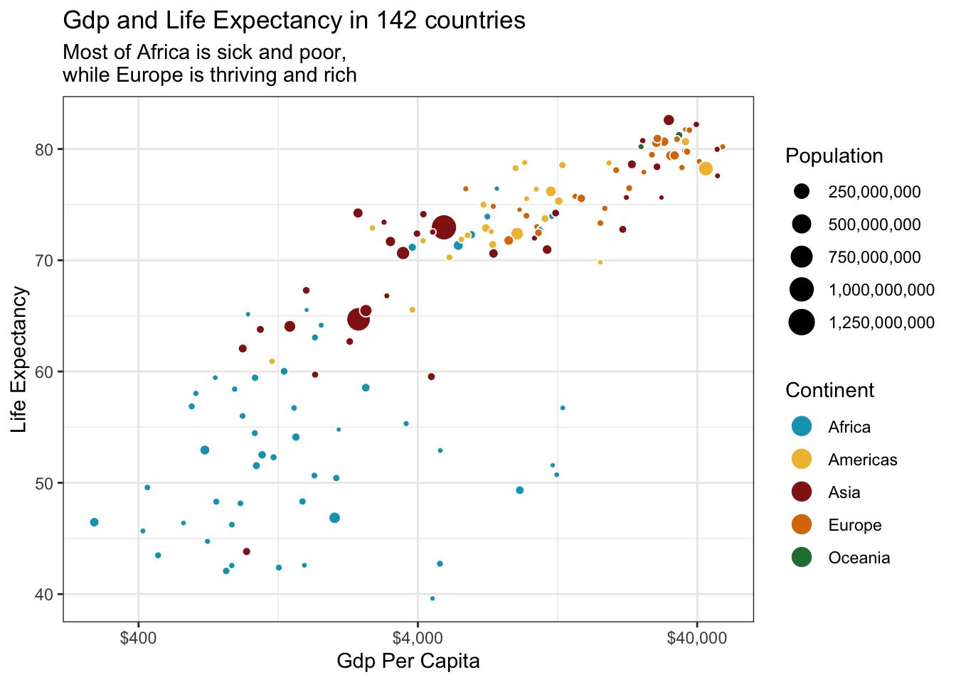
Now, we need to save the graph to an object. Let’s call that object cool_plotly_graph. We also need to add another argument to aes(), called text. This will make it so we only see the country name, instead of a bunch of random information that we really don’t need.
cool_plotly_graph <- ggplot(data = gapminder_2007,
                            mapping = aes(x = gdpPercap,
                                          y = lifeExp,
                                          size = pop,
                                          fill = continent,
                                          text = country)) +
  geom_point(shape = 21, color = "white") +
  scale_fill_manual(values = met.brewer("Lakota", 5),
                    guide = guide_legend(override.aes = list(size = 5))) +
  scale_x_log10(labels = label_dollar(accuracy = 1),
                breaks = c(400, 4000, 40000)) +
  scale_size_continuous(labels = comma,
                        guide = guide_legend(override.aes = list(shape = 19, color = "black"))) +
  theme_bw() +
  labs(title = "Gdp and Life Expectancy in 142 countries",
       subtitle = "Most of Africa is sick and poor,\nwhile Europe is thriving and rich",
       x = "Gdp Per Capita",
       y = "Life Expectancy",
       fill = "Continent",
       size = "Population")
Now that we’ve saved it to an object, we need to add the ggplotly() to the code. The tooltip makes it so the text argument in aes will show up in the ggplotly() graph.
ggplotly(cool_plotly_graph, tooltip = "text")ggplotly does not support subtitles or multiple legends, so that is why they disappeared.
That’s how you make a basic interactive plot using ggplotly()!